Concept project only. Not an official Glossier or Sonny Angel product, and not affiliated with, endorsed by, or produced by either brand. Created for academic and portfolio purposes.
TL;DR
Overview
Background
A speculative cobrand between Glossier and Sonny Angel, sparked by the rise of blind-box collectible culture and the growing destigmatization of self-care on social media.
Problem
Balancing two distinct brand identities so neither disappeared, while making the concept feel genuinely brand-ready, not fan art.
Approach
Solo, alongside full-time school, a part-time job, and leadership extracurriculars, I used a MoSCoW framework to prioritize, then led with Glossier's conventions while keeping Sonny Angel's identity intact.
Outcome
A full concept collection, logo, packaging, figurines, and sticker sheet, presented at NYU's IDM Showcase to 88.7% visitor satisfaction.
6 Deliverables
Co-branded Logo, Moodboard, Figurine Designs, Sticker Sheet, PR Box + Packaging, 3D Figurines, solo, in 16 weeks
BACKGROUND
Blind boxes and self-care were both having a cultural moment. Nobody had put the two together yet.
Sonny Angel's blind-box format had exploded across collector culture, while self-care content was becoming inescapable on social media, both driven by the same audience. No cosmetics and toy brand had cobranded across that overlap yet, so I designed a fictional exploration of what one could look like.

DESIGN APPROACH
No team meant prioritizing hard, not designing more.
Without a team, I built a MoSCoW chart to rank deliverables against full-time school and part-time work. Iterative design paired with research into Glossier and Sonny Angel's shared values, minimalism, emotional connection, and collectible culture, guided what made the cut.


WHAT DIDN'T WORK
Cute wasn't the bar. Cohesive was.
3 figurine concepts that were cut and the rationale. All three got cut for the same reason, individually had potential, but none built a theme both brands' identities could actually live in.
🚫
Concept 1: Hoodie
A hoodie version nodded to Glossier's merch line the same way, cute, but disconnected from any unifying theme.
Concept 2: Face Stickers
A cherry-topped figurine leaned into Glossier's cherry branding, but it already exists as a standard Sonny Angel with a logo added, no real synthesis of the two brands.
🙅🏻♀️
❌
Concept 3: Cherry
A facial-sticker concept risked manufacturing issues, after reviewing Sonny Angel's full release history, I found no prior figure had ever shipped with stickers on the face.
👼
Concept 4: Sleep Mask
A Sonny Angel holding a blanket, hugging a pillow, wearing a sleep mask and a light pink bunny hat, pink as a direct nod to Glossier. Sleep and comfort read as self-care instantly, cohesive with both brands at once, the thing the other three never found.

COBRAND RESEARCH
Studying five real collabs shaped how I approached two brand identities.
After three figurine concepts didn't click, I researched LV x Murakami, Sabrina Carpenter x Dunkin', Olivia Rodrigo x Glossier, & others and found they take after the host brand's identity.
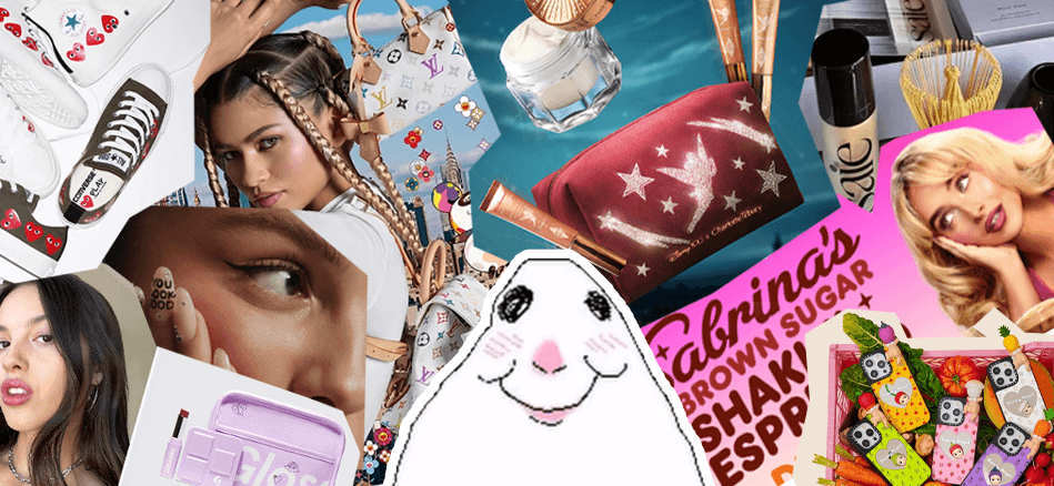

Since Sonny Angel functions as merch within Glossier's strategy, I led with Glossier's conventions, PR box, palette, while keeping Sonny Angel's character intact.
THEME SELECTION
Three failed one-offs taught me the problem wasn't the ideas, it was the missing theme.
I tested dollhouse, floral garden, and fairy directions, all felt imposed rather than native to either brand. Self-care fit naturally, core to Glossier's identity, trending across social media, and had potential with Sonny Angel's own history of themed special series.

PRODUCT SELECTION
A repurchase problem past Glossier collabs never solved.
Keeping formulas untouched meant the collab could still feel exclusive through packaging, not through a formula people would lose access to the moment the drop sold out.
😕
Pain Point
Past Glossier collabs used exclusive formulas, so once a collab ended, people couldn't rebuy a product they loved.
Solution
Formulas stay the same, only the packaging is limited-edition, so repurchase stays possible.
💡
Final Designs — Glossier x Sonny Angel
A closer look at where the concept landed: 3 figurines built around the after-shower wind-down, each staying true to Sonny Angel's existing mold and production style, dressed in Glossier's world.
Figurine Designs
Blue captures the aftermath of an "everything shower," hair towel and body towel included. Purple wears a silk cap for overnight hair care. Pink settles into rest, wrapped up and ready for sleep. Each stays within Sonny Angel's existing body mold and production style, informed by researching past collaborations and their regular series.
Sticker Sheet
Both brands already sell stickers on their own, so this sheet follows Glossier's typical sticker-sheet layout while the content, the figurines and an angel-wing motif, stays distinctly Sonny Angel: the same balance principle as the packaging.

Cobranded Logo
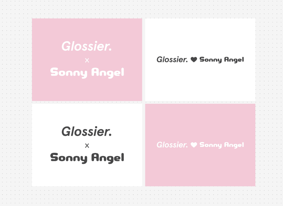
I researched how other brands handle cobranding, usually two logos joined by an X or a "|" bar. I kept the X and added a heart, then carefully balanced type sizing so neither mark read as bigger or more dominant than the other.
PR Box + Packaging Design
The figurines are sold in Sonny Angel packaging, keeping the brand's signature hexagon shape. Skincare packaging followed Glossier's own format. Both carry cobranding elements without losing their own identity.


3D Figurines
These renders show how the blind-box figurines would look and feel as an actual manufactured product.

REACTIONS