


Organization

WEX
Role
Product Design Intern
Tools
Figma, FigJam, Gemini, Cursor, Jira, Google Suite
Timeline
8 Weeks (2025)
WEX — Simplifying alerts to streamline finance workflows
My role
At WEX, I worked on multiple design initiatives for WEX's Corporate Payments' team and line of business. This particular initiative entailed designing a solution for the notifications system, serving as an important point of communication between WEX and business payment customers. I primarily worked on research and design system efforts, supported by our design, research, PMs, and stakeholder teams.
Collaborators
Adam Cassidy
Nick Zimmerman
Lucas Montandon
Jeet Purohit
Chris Dilios
Paola Aguayo
Rebecca Clark
DESIGN SYSTEM COMPONENTS
1
Notification-system components handed off with fully customizable properties.
UX WRITING DELIVERABLES
12
Copies handed-off for notifications and different categories of alerts.
PROTOTYPE TURN-AROUND
<2
Weeks of moving from ideating and iterating, to prototyping in Figma.
PROBLEM
Outlining the Problem
Finance workers find it challenging to stay informed and take action from the current alert system because they must context switch between 2+ tabs. This left many items delayed, and our users often felt slow and inefficient.
Problem

RESEARCH AND DISCOVERY
Prior user interviews and research had been conducted before I joined this project. To reopen and kickoff this project, I focused on synthesizing our existing efforts and data in order to discover improvement opportunities, current strengths, unseen pain points, and deeply understand our finance teams.
USER INTERVIEWS AND ANALYSIS
Users wanted to immediately take action and keep an usable record of older alerts
Using Dovetail, UserTesting, and user interviews, I observed repeated complaints, successes, and behavioral patterns with users that work with our alerts daily to guide my understanding of the situation. Here, it was revealed users struggled with searching for specific alerts (like card transactions), keeping record of older alerts, and taking action.

Note: Blurred for confidentiality reasons.
While reviewing current workflows observed by the research team, I personally mapped the user journey to pinpoint what part of the process should be a focus.
Our users experienced "overwhelm" primarily while locating specific records, specifically the process of specifically filtering information manually. After identifying the bottlenecks, I found that users highly valued accessing all relevant information in one place and being able to immediately take action. Full map is not shown due to confidentiality reasons.
COMPETITIVE ANALYSIS
Fintech competitors prioritized immediate actionability and strong record-keeping
Through signing up for demos and discovering patterns from fellow fintech companies I immersed myself into the shoes of the client, helping inform our ideation process. Full audit is not shown due to confidentiality reasons.

KEY INSIGHTS
Active Pain Points
AS A USER, I'M FRUSTRATED THAT
Important items are too easily forgotten or delayed
Finance controllers checked emails for alerts, but had to log into the WEX platform to investigate issue
Recording important information relied on controllers' DIY solutions
Had to manually record it elsewhere for future use, no centralized place for older alerts
AS A USER, I WANT TO
Review issues in full details immediately
Easily take relevant action after being alerted
Conveniently track and revisit alerts
Sensitive finances and urgent items need to be conveyed immediately

DESIGN FOCUS
Needs and Constraints for Phase 1
To align potential design solutions with our vision, it was important to map out our priorities. Bringing in insights from our research and multiple productive conversations with our PMs and stakeholders, I mapped my understanding of our user needs, business goals, and technical constraints, which helps me visualize our desired long-term results into the process. This was also productive to have on-hand for a quick review of our shared goals.

PROBLEM + OPPORTUNITY STATEMENT
The Opportunity


IDEATION: WIREFRAME SKETCHES
Visualizing Notification System Ideas
I explored side-panels, popovers, inbox, toast designs for our notifications system. I set up a timer for 10-minutes and sketched out all my brainstormed thoughts. Once I finished, I added notes and sought feedback by discussing my thought process and expanded the conversation by applying further considerations long-term goals.

Informed by our research, I presented that "Inbox" highly addressed users' pain points regarding "context-switching" and recordkeeping. The "Inbox" also aligned with design patterns familiar to our clients, agreeing with Jakob's law that suggests users find comfort in patterns they already know.
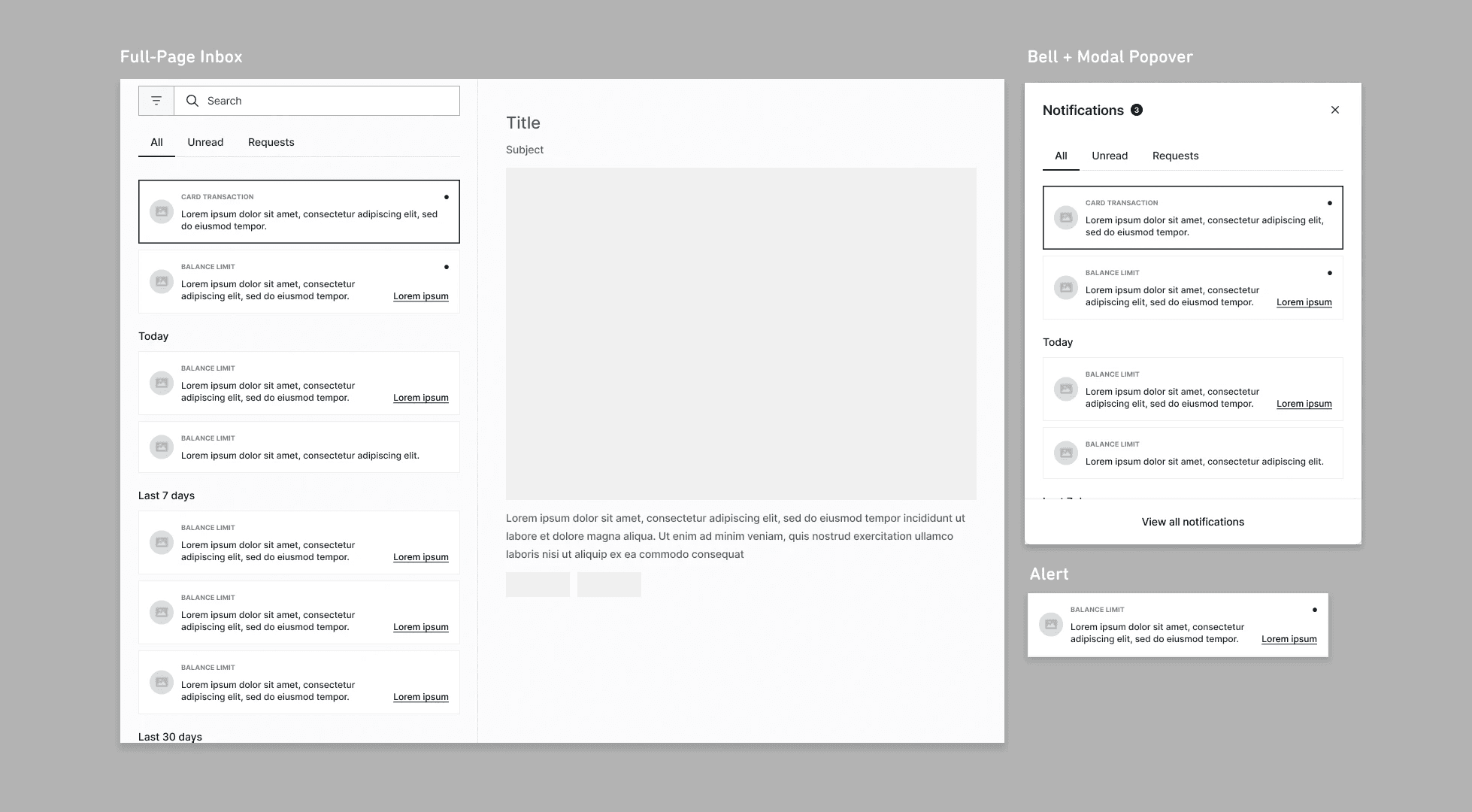
PROTOTYPING: MID-FI PROTOTYPES
Mid-Fi for 2 Directions: "Inbox" and "Popover"
As a team, we ensured open communication and checked in with one another, so that the designs remained consistent and on-track. Our stakeholders and team concluded that an "Inbox" and "Popover" were the top contenders for our goals. One compelling reason is that both designs put alerts front-and-center for seamless discoverability and action.

STAKEHOLDER + PM FEEDBACK
Evaluating our Best Options
Heading into the final stages, we tested the usability of the mid-fi prototypes with stakeholders then synthesized their feedback onto a document. Testing taught us that the "Inbox" aligned more with our users' workflow, which requires attentively taking action from important alerts, while on the other hand, the "Popover" was better for a quick preview.
It was decided that the "Popover" design would be set aside for now, and our team was going to prioritize implementing the "Inbox" design. My team and I were on-track with the project, given my internship was wrapping up soon.
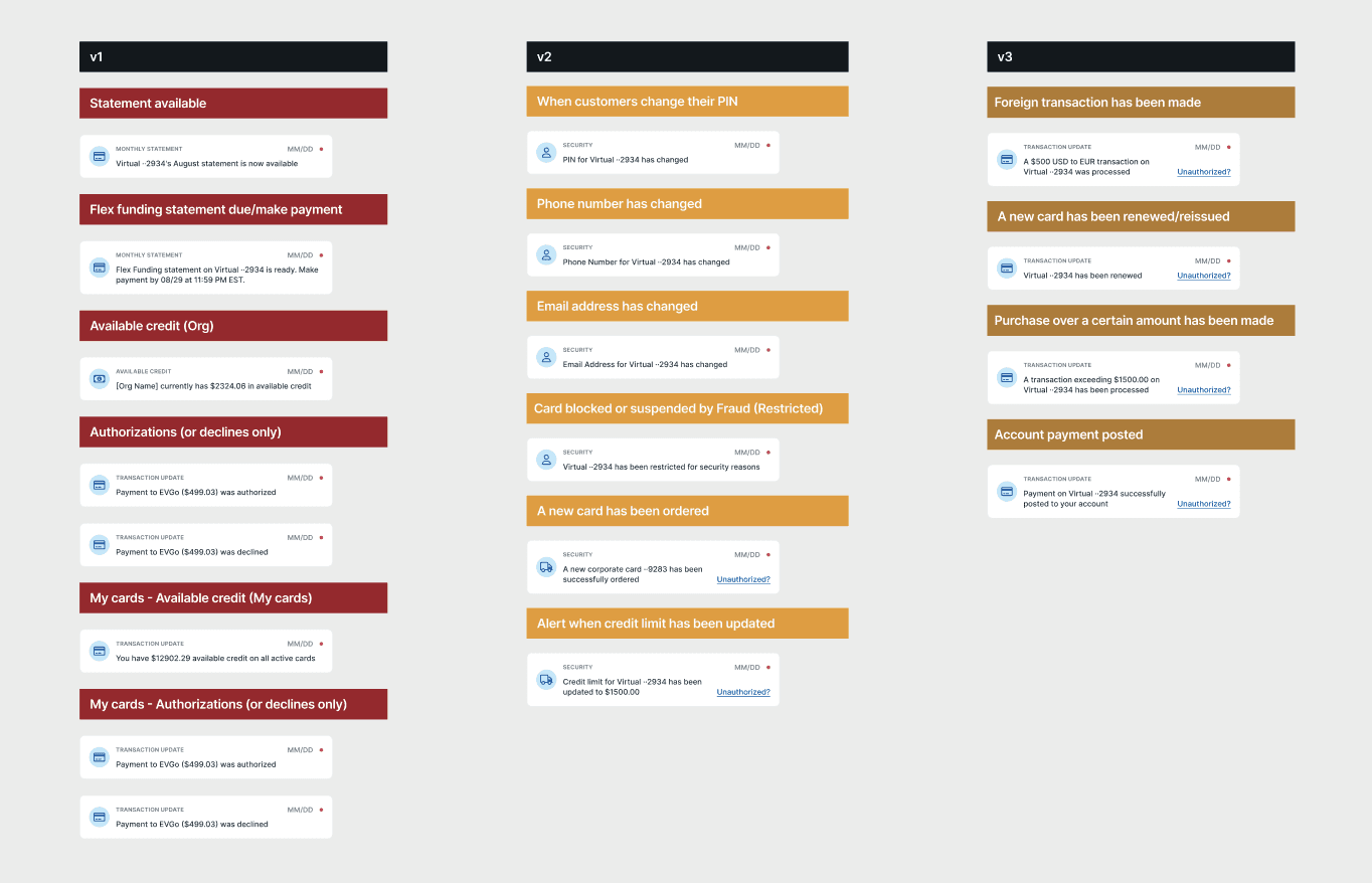
UX WRITING
Ambiguity causes anxiety in finance; we needed to ensure every alert had a clear resolution
One additional task I was entrusted to was handling the microcopy for the different types of alerts. I applied communication strategies like "severity + cause + action" and the 12-Year-Old Rule to better convey the urgency and clarity of the content. Precautionary efforts were also made to avoid "unclear" or "misleading" messaging.
Contribution Highlights!

Designs/components can be reused in different contexts to support long-term growth and ease tech implementation.

Testing confirms that the system successfully addresses pain points, also leaving room to continuously evolve in the future.

Validated design decisions and consolidated takeaways to inform every detail and future design plans.
Final Deliverables

NEXT STEPS

